Daghigh Construction Branding
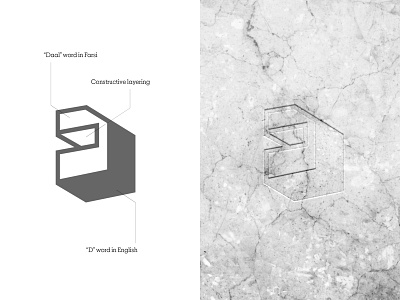
We designed an angular logo for Daghigh company because the shapes and straight-edged lines found in a logo suggest professionalism, efficiency, and stability appealing to the left brain of the audience. It creates a balance of practicality and if combined with color like blue can evoke a perception of dynamic modernization. We make use of this to create a logo that defines stability, power, and strength.
