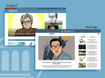
Balairung Press Website UX Redesign
http://www.balairungpress.com/ is my university news website posting local news. One of my pain point reading news on that website is all the news in chronological order. I cannot see popular news or the best news they've made. I also cannot see the news preview to see if the news is really interesting or not.
So I redesign that website. I made it so there are 3 news order: the newest news, popular posts (pos populer), and editor's picks (pilihan editor). The newest will be put in the middle and both popular posts and editors' picks will be put i list on the right side. They also have news preview so people can see if they want to see the news or not.
More by Linus Randu View profile
Like
