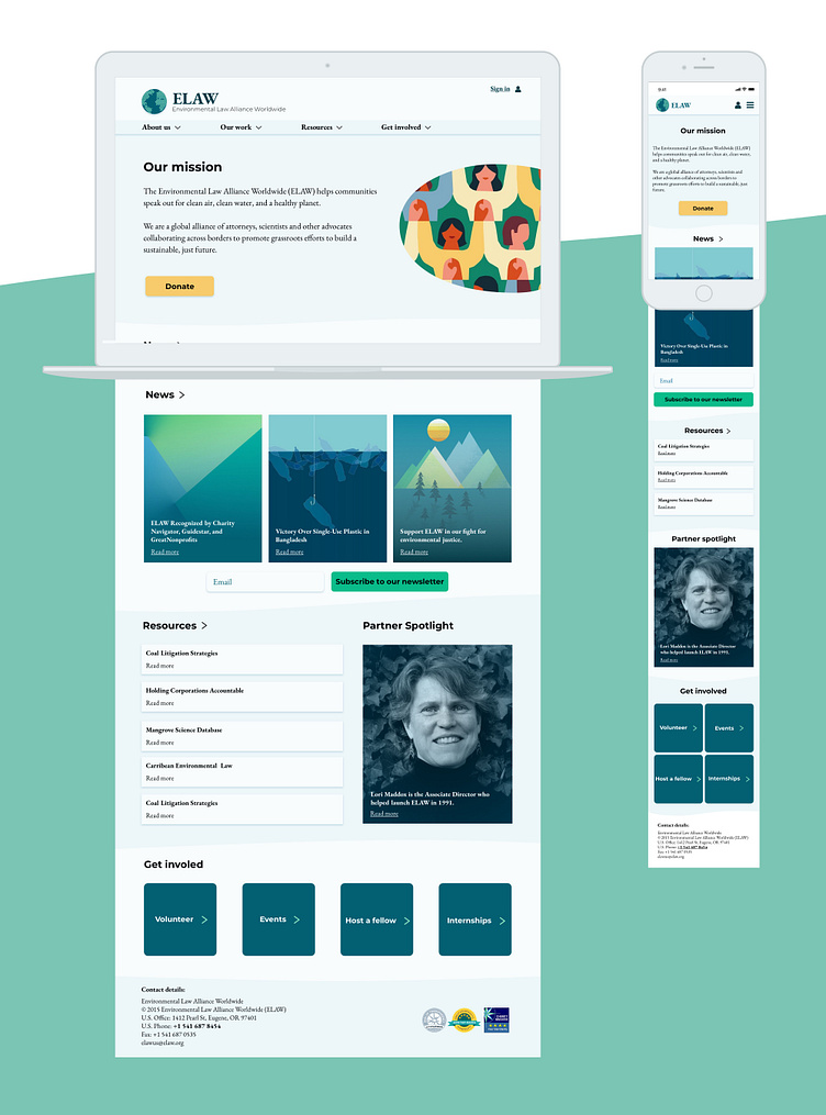
Charity Website UI Design
Environmental Law Alliance Worldwide (ELAW) is an alliance of lawyers and scientists that help communities around the world speak out for clean air, clean water and a healthy planet.🔬⚖️
The current ELAW website is somewhat overwhelming due to its cluttered presentation and overload of information. There were several different font families, sizes, weights and colours. Although they had a colour scheme, they did not always adhere to it. The charity has a lot of excellent work to show, yet they had not communicated their values and victories effectively. See https://www.elaw.org/
To read my full case study, visit https://bit.ly/2Y0dP7i
Final Design Solutions: – Logo I came up with many ideas, building on from the mood board and word association with the brand values. For example, upwards arrows and triangles. In my final logo, you can see that I have kept the overall shape of their original design. However, to represent a global community, I placed many dots together and arranged them into the form of a globe. As I chose to do this project mobile-first, I created a smaller logo for the mobile version of the website.
Main improvements: 1. I relocated their mission statement to the top of the homepage. So that the user doesn’t have to think when they open the website, I put their mission statement right at the top in plain view. This change makes it more visible to everybody what they do. Beforehand, they had hidden this away in the ‘About us’ section.
2. Images and colour schemes that echo their values. As I explained above, I have composed images that reflect their values more closely. The pictures and illustrations that I collected have a consistent style, to give a more harmonious character.
3. Typography that communicates that ELAW is a community of experts. Applying a serif font family, EB Garamond, for the body of the website gives off a more formal and traditional impression. To keep it simple, I have only used one extra font family, Montserrat, that I used for the main headings and subheadings. When Julieta Ulanovsky created this font, she was inspired by the words dedication and care, concepts that align well with the charity’s purpose.
4. Adjusted the position of the donate and subscribe buttons. Although their current buttons are readily accessible, I moved their position to increase the likelihood of someone donating or subscribing. "People give something if they get something. People these days are afraid to share their personal data." — Anandhakrishnan If someone is going to donate or sign up, it is necessary to offer something to the user before asking for their money or email. Hence, I positioned the sign-up next to the newsletter, showing them what they would be getting if they signed up. Additionally, placing the donate button underneath their mission statement will build more trust, as the user will better understand why they should give money and what the charity’s cause is. Admittedly, if I were to design this again, I would make it even more explicit what their money would be helping to accomplish.
5. Lastly, I checked that all the text colour and sizes met AA or AAA accessibility standards. It is essential to consider the colour contrast between the text and the background on websites, as it affects some people’s ability to perceive the information (i.e. how they receive the info visually). For a significant number of people, there can be difficulties distinguishing some shades, or some colours. Around 1 in 12 men and 1 in 200 women have some degree of colour vision deficiency. — Gov.Uk I used the Stark plugin on Sketch to check the contrast of the text against the background colour. In doing this, I was able to make sure that my design met the accessibility standards (with a contrast ratio above the recommended minimum of 4.5:1).
See more here https://bit.ly/2Y0dP7i
