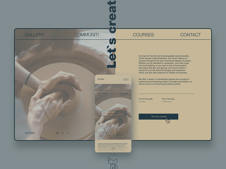
Pottery workshop design
Hey! Today we developed the design of the pottery workshop site. On this resource, the user can view works of the studio, learn about training courses, and then sign up for any of them. With the help of our design and color palette, the website turned out to be convenient and pleasant to perceive. We made color accents on the main elements of the project, such as the button to view the courses. A simplified interface makes it quick and easy to navigate the site and get to the right page. ****************** Just drop us a line: hello@brightlab.me Follow : behance / website/ Instagram
More by Brightlab View profile
Like
