Analytics Chart
Project Title: Health and Fitness Analytics UI Design
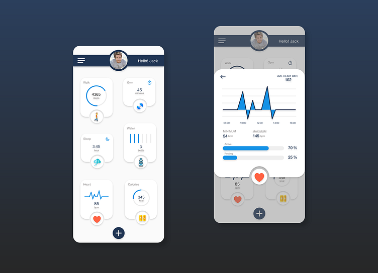
Description: This design features a comprehensive health and fitness dashboard interface, created as part of a daily UI challenge. The dashboard provides users with a clear overview of their daily activities, including steps walked, gym time, water intake, sleep duration, heart rate, and calories burned. The design is clean and modern, with each metric displayed in its own card for easy readability.
The highlighted section on the right showcases a detailed heart rate analytics chart, providing users with insights into their average heart rate throughout the day. The chart is visually engaging, using a line graph to display fluctuations in heart rate over time, accompanied by statistics for minimum, maximum, and average beats per minute (BPM). The use of contrasting colors helps distinguish between active and resting states, offering users a deeper understanding of their heart health.
This health dashboard is designed to be both functional and visually appealing, making it easy for users to track and analyze their daily fitness activities.
Tools Used: Figma, Adobe XD
Challenge Focus: Creating a user-friendly and visually compelling health analytics dashboard.