browser
I feel like browsers are still a bit too much cluttered and in the way. Even more so for 2020.
This is going to be an ongoing project where I'm going to publish different ideas on how to simplify or modernize the web browser.
I'm also just getting back into designing so I'm not really into the animating scene yet. Gimmie a bit of time to figure this thing out and you'll get some sexy shots.
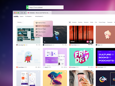
Anyways, this idea is basically taking most of the chrome menus and puts them in a 3D/Haptic touch menu. If you've got the trackpad or magic mouse, touch and hold or 3d touch to bring up the right click options.
There is also no need to seperate the address bar and tabs. I've never understood why this was never merged into one function, a tab is an address bar. It's redundant to show what web address and page I am on. Pulling these two into the same are, or making them the same function, allows for more website showcasing.
I've not shown this, but when you scroll the address bar will go away. :OOOO Crazy.
I've also not taken up space by putting a box or circle around the icons. Truly groundbreaking ideas right here.
