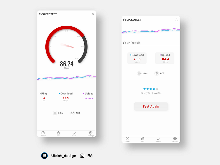
OOKLA light mode redesign
OOKLA's app has a dark ui and is pretty good in terms of design. I felt a light mode would also be a great design idea as it's usually the day time that there are issues with the network providers and not much at night.
I also added some minimal aesthetics to the design. Making the speed details apt and taking the users attention more towards the data.
If you've liked this redesign do follow my page.
You can also find my work on instagram where i post everyday. My Instagram
Thank You !!
More by Prajwal Kumar ss View profile
Like
