Care Buddy - Home
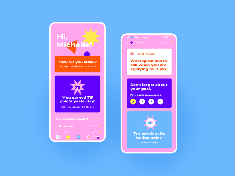
Who said medical apps need to be white or blue? Why not all the colors ?
This seemed like the way to go, considering our target demographic were - you guessed it - millenials.
While designing, I wanted to distance myself from the conventional UI style for most medical apps, and tried to create an engaging, youthful space that just feels engaging and dynamic.
Hence - the wild color pallete, chunky font, simple and sharp illustration - and voila, unconvential, here we come!
Feedback is much appreciated! What do you guys think about using so many colors, is it bad UX or have we all become such power-users that color is no obstacle ?