Bianchi Bella's Olive Packaging
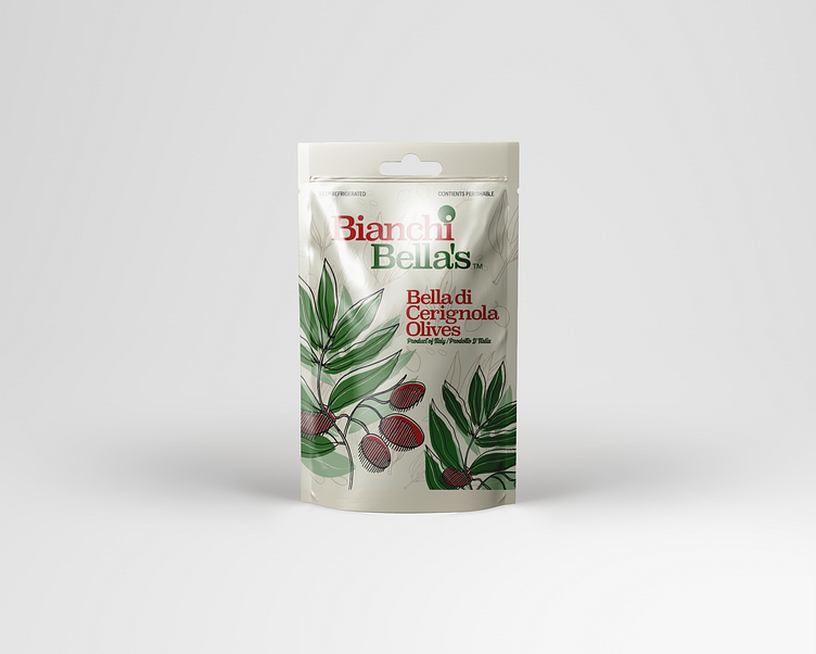
An evolution of a school project I've decided to expand on. The design is meant to take the traditional Italian-themed design of rolling hills and bright greens found on some packaging to the next level, by making it look more elegant with deeper reds and greens, also meant to complement the deep red of the type of olive. I've made the choice to focus in on the illustration aspect of the olive branch, it also being my first time experimenting with illustration in packaging design.