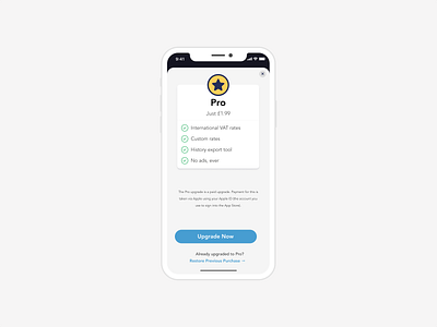
In-App-Purchase, Upgrade View
When a user taps on the 'Upgrade to Pro' button they are presented with this view. From here they can see an outline of the additional functionality they get access to when they upgrade to pro and the cost of upgrading.
I decided to go for a more clean and simple UI to match the rest of the app, something I feel the users would be more comfortable with.
More by Oliver Edis View profile
Like
