Daily UI 004 :: (Calculator)


Hi folks! So rather than a challenge, this is more of a case study that I got a chance to work upon. I am a apple fanboy and I have a very unusual fascination with the simplicity of ios devices since day 1.
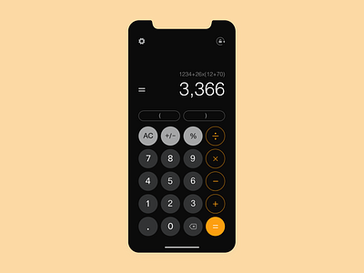
But the calculator app was the one where I think some UX improvements were needed because I was facing a lot of issues with it. So without wasting any further time I will start off by listing the UX problems that I was facing and what solutions I came up with whilst not changing the UI completely. You can refer to the last image in the attachments section for the current ios calculator design and the first image for the redesign that I did. In the middle 2 images I have created the research, ideation and wireframes for the creative process. There are 3 major problems and 3 minor adjustments that I have made to the current design and here they go.
Problem 1: The most annoying thing with the current ios calculator according to me is that you have to swipe back on the digits that you have typed to remove them one by one(Got to know a few days ago, had no idea we could do that also). Also You cannot remove a digit from in between.
Solution: Just on the right hand side of the number 0 I have added a back button. It is close to the finger for easy access. And you can click anywhere between the typed numbers and the cursor will be placed there.
Problem 2: We cannot view the whole equation that we are solving or have solved. Instead it just shows us the final result. This can be a bit of hassle when performing some high profile calculations and the margin of error is not required.
Solution: On the top of the final result you can now see the whole equation that you solved so that you can see if you are solving the correct equation or have made any mistake.
Problem 3: There is no signifier as to how you can view the scientific calculator. For a newbie it can be tricky a tricky task if his/her auto lock is set to off.
Solution: On top right I have added a rotate screen icon which will rotate the screen and you can view the scientific calculator options.
Minor Tweak 1: I have also introduced the brackets on the main screen so that you can perform some long calculations involving various operations at one go.
Minor Tweak 2: A settings section is also introduced where I thought of giving options to customise the operations in your calculator both in standard as well as scientific. And another option to switch the controls for left-right hand users.
Minor Tweak 3: I have changed the button scheme of all the 4 major operations on the right hand side from yellow fill to yellow border and let the '=' button remain in yellow fill as I think it is the main CTA button here.
It was a bit larger article and I am glad that you guys read it till the end. Feel free to post all your suggestions to improve the design further and any other new ideas, problems and solutions are also welcomed.
