PlenDo
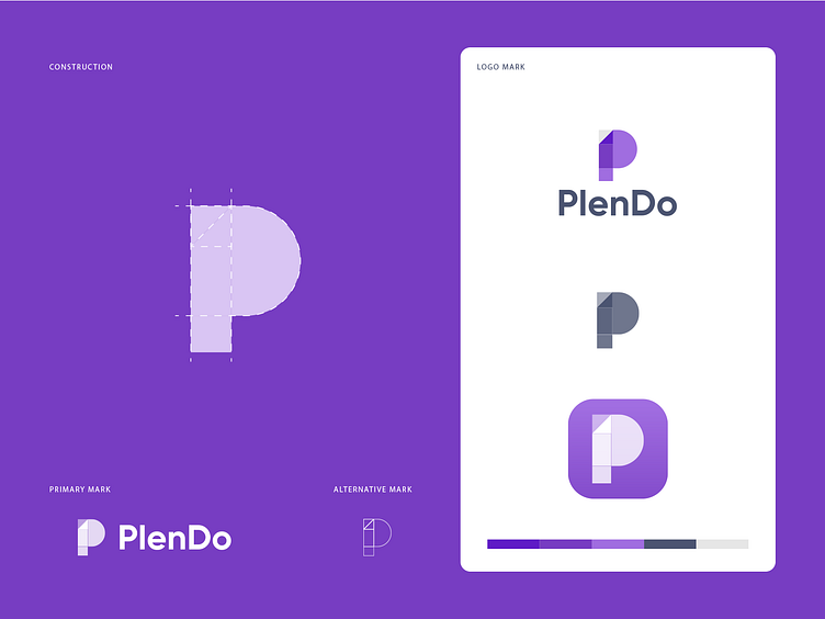
It's an app logo that features brand initial 'P' in a simple but creative way. The upper half of the P is heavier because it imitates 'D' of Do. So basically, both initials P and D can be seen in one place. How do you see it?
------------------------
Press “L” to show some ❤️
Are you looking for a logo (re)design for your business? I’d be happy to hear your story! Feel free to reach out!