Oktobrewfest
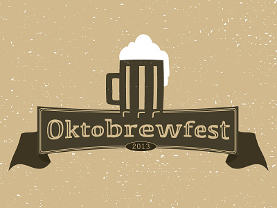
Local Oktoberfest is being rebranded as Oktobrewfest. The logo needed to emphasize the brew part in the logo. I played with lots of concepts but landed on this. It's subtle but the brew is straight while the okto and fest have a slight curve. Do you think the brew stands out?
More by Steven Held View profile
Like
