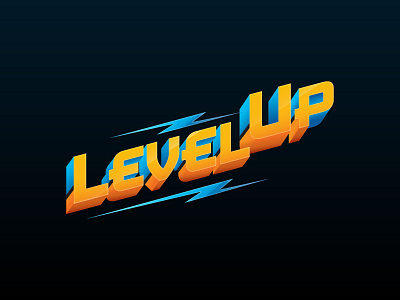
Level Up Lockup
For this lockup I worked closely with one of the leaders in the SWOT management team for Flight Centre Travel Group. This lockup was to be used in presentations and other collateral that would be shown to retail staff within the company. The client had a particular look and feel in mind, so this had to be considered when coming up with the design.
The end result contains various colours, gradients and shadows/highlights to add more depth to the design. The layout of the text also signifies 'levelling up', by angling upwards and also having the word 'up' sitting slightly higher. This lockup is very different to the standard Flight Centre branding - therefore creating a point of difference in terms of design.
More by Anthony Carter-Bell View profile
Like

