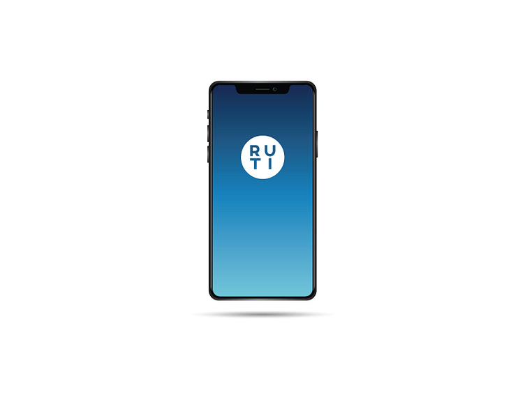
RUTI - Branding/UX/UI Design
This is the splash screen for an app I'm designing for a medtech startup.
What I love most about working with startups is that I have the chance to wear all the hats I want. They designed a really complex SaaS-delivered client portal. Because the clients are all super busy hospital administrators working in hectic environments and because we're working with life & death issues here, user-centered design is super important here -- and I love the challenge.
So, back to the plethora of hats. RUTI is not the company's name. It's the name of the system they're building. They had a really hard time coming up with a name for it. I ended up providing the name. It came to me in the shower. RUTI stands for "Rural/Urban Transfer Initiative". The logo is probably the most simplistic I've ever designed. We wanted something that referenced healthcare, but not in an obvious way. The R-U-T-I letters are arranged like what I saw on a pill I took that morning. It worked out nicely. I've received a few compliments from healthcare workers, and that's very cool.
I'm currently in the prototyping phase of this project. I can't wait to test it out in a hospital environment.
