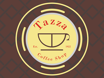
Daily Logo Challenge 6/50: Tazza/Coffee Shop
Checking in for day 6! I was experimenting with curvatures and geometric patterns.
Overall, I like the colours. The brown for coffee and the yellow for parchment or writing, since I see so many people in coffee shops writing the great American novel (or something like that). I also went for a serif font. I felt like it gave off a sense of class and history.
As part of my research process, I watched a great TED talk on the history of coffee shops! You can check it out here: https://www.youtube.com/watch?v=_83A7vaHTiE
More by Daniel Ura View profile
Like
