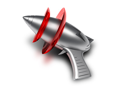
AppZapper "3"
In 2016 during parental leave I spent several evenings envisioning what an updated version of the AppZapper icon could look like, which I had originally done all the way back in 2005. Fully modelled and textured in 3D. Aluminum vs. Aqua. More of a reflection of the current Apple hardware look. Makes me miss the days in which rich Mac App Icons where still a thing. Flat glyphs on squircles aren't always the most awesome.
More by Jasper Hauser View profile
Like


