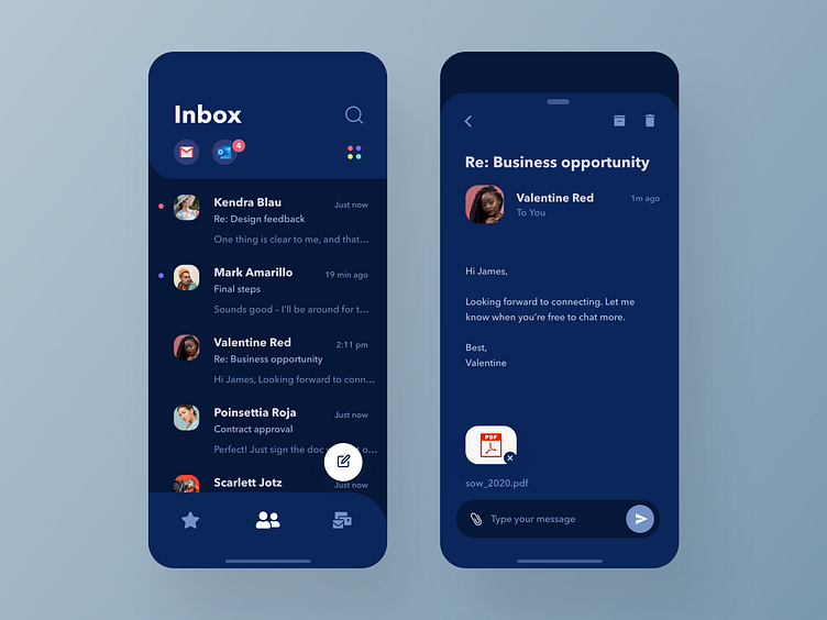
Simple Email Client – Friendly Dark Mode
⚡ ANNOUNCEMENT ⚡
I'm building a UI design course at https://www.theuilab.co
Please check it out and send me feedback or any questions you'd like me to answer!
Contact me at garethjohnsonx@gmail.com
Notes for this design:
A not-so-desaturated take on dark mode for the simple email app design. Dark mode themes are often either a little harsh, or a little desaturated. While this can feel "powerful" it can also feel a bit heavy after some use.
At the end of the day, productivity apps are about reducing stress and staying on top of a busy life, so a dash of optimism and lightness of experience can be a little helpful... even in dark mode.
Thanks for taking a look! Let me know what you think, and please share feedback.
Thanks, Gareth ✌️
More by Gareth Johnson View profile
Like

