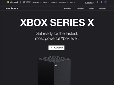
Xbox Series X - tweaked homepage
Had some free time today and decided to tweak the new Xbox Series X homepage Hero Unit. You can see the original on screen 2 for comparison.
I opened it in Chrome, used Inspect and tweaked some of the styles. This is not a redesign. I wanted to make small alterations to improve the impact of the existing page.
Sub nav menu: Added borders to separate the main site nav from the product sub nav. The brand name is separated from the nav items to avoid confusion.
Typography altered to give a clear hierarchy between title and sub-content. The brand is strong enough that the product name can be the feature. This helps add more impact and excitement to the main title and feature.
Content tweaked slightly. By adding "Get ready for..." I wanted to imply that this product had not launched yet. When launched it could be changed to "Get the fastest..."
Play button styled to complement the Xbox logo on the machine.
More spacing between sub nav and content. This helps make the headline stand out.
Leading: By making the sub-content width narrow, it creates a funnel to draw your eye from the title down to the play button and product image.
Hope you guys like.

