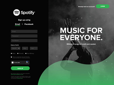
Spotify - Sign Up Page Concept
5/9 - I'm new to the whole UX and UI scene. I have begun my design journey by doing daily challenges. The current Spotify sign up page is just a white background with text and buttons. I wanted to create a more engaging sign up by implementing a large side header image with their slogan. I brought in color by applying their green accent color and I incorporated movement within the page by including the wave like shape at the bottom right of the page.
Like
