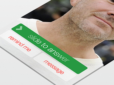
iOS7 Call
latest shot in the iOS7 concept extravaganza :)
first thing i had to do was change the labels on the buttons, the new iOS7 version has "remind me later" and "respond with text" so i changed them for the following reasons...
1. The remind me later can simply be shortened as it's self explanatory and the user will understand what it means within the context of the screen
2. The word "text" is used on the other button when the icon for the app itself is messages (even though you can send as a text message if there is no data connection for iMessage). There should be a consistency in labeling so the user knows exactly what to expect when they tap that button. Also message is shorter than "respond with text" which enables quicker processing of data
after changing the labels i wanted to change the position of them, the "slide to answer" is in the exact same position as the slide to unlock (making it easy for them to interact with) and i never understood why you would have the same behaviour but style it differently and move it's position down.
The other buttons have been moved below the main button as they are secondary to what we ultimately want the user to do which is answer the call.
real pixels have been attached as normal :)

