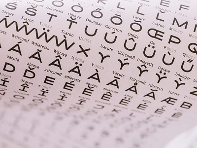
Kaito® Sans: Glyphs
For this typeface (more specifically the Normal style) the “O” was the basis for the development of all characters because this is obviously the glyph most similar to the elliptical orbit previously mentioned. Letters like “C”,“D”, “G”, “Q”, “U” and “S” followed this one idea along with its oval shape, and pshhht… look at the “Y”! It reveals one cute and different personality, compared to other characters in Kaito Sans.
Available at https://www.kobufoundry.com/fonts/kaito-sans/
More by KOBU Foundry View profile
Like
