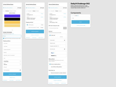
05.08.20 #DailyUI Challenge 2 (A checkout)
Rough night with baby - didn't have the mental energy to design a checkout so took this as an opportunity to do 'a cover' of the Shopify Checkout mobile experience.
Happy with the result, curious about spacing. Also happy with pen skill progression.
Hardest thing about doing a copy is when you can't match the fonts up exactly. Made it hard to keep track of the hierarchy formatting (esp with two different families of SF pro. is it iOS choosing fonts for headers?). I guess this is a reminder to get familiar with text styles.
Check out the shopify merchant ornotbike.com if you ever need cycling clothing or athliesure wear. Great company, great people. (sorry for the abandoned cart 😉)
More by Byron Anson View profile
Like
