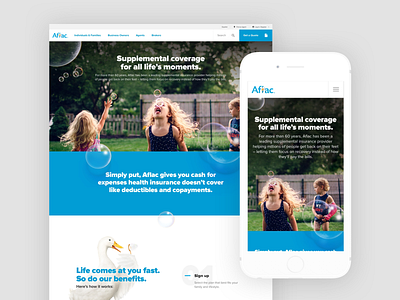
Aflac Homepage Redesign
Aflac came for a homepage refresh. We found that many folks knew Aflac for “the duck” but didn’t actually know who they were or what they did. Their existing homepage was on the extreme utilitarian end of the spectrum and didn’t give any context. We aimed to evolve it into something fun, reassuring, and educational while still providing utility.
Role | Concept, Design Direction, Motion, Prototyping
See the full case study on my folio:
www.isaacmart.in/aflac
More by Isaac Martin View profile
Like
