Identity design for SoundBox

New brand identity design for SoundBox.
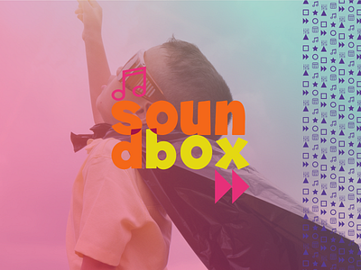
This picture represents the main features of the brand and works as a teaser to the client. (whom, I'm happy, loved it)
The logo and identity is completely dynamic and responsive since colors, logo and patterns adapt to every surface and space. The logo is not limited to one color because 10 combination pulled from their palette, were created to represent the constant change and stimulation the kids need. (the audience of this business).
That's why you'll notice the music icon (top left) and 'forward' icon (bottom right) representing the purpose of the business and future growth and movement forward. Both combined shape the logo into a square box.
Would love to hear your feedback on it!