Making Stars Useful
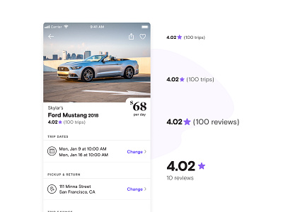
Working with the talented lead Product Designer on the project Zach Cheung, and a host of cross-functional friends, we made it easier to compare cars via star ratings.
Our old rating system was composed of 5 star icons, but this made it harder to compare similarly rated cars with lots of reviews. Now the way we display ratings improves our guest’s ability to use them when making trade-offs between vehicles—and the new UI was built systematically, with the goal of making how we rate stars more consistent throughout the product, something our previous star system has started to stray from.
One difference you'll notice is between that of trips vs reviews...this was deliberate: trips are at the car level, i.e. how many trips it has gone on, vs reviews being at the host level, i.e. how many reviews they have gotten across their potentially many cars. These labels were a bit more confusing before, so we created more consistent language.
