Blobfish Beer Festival – Branding, Concept


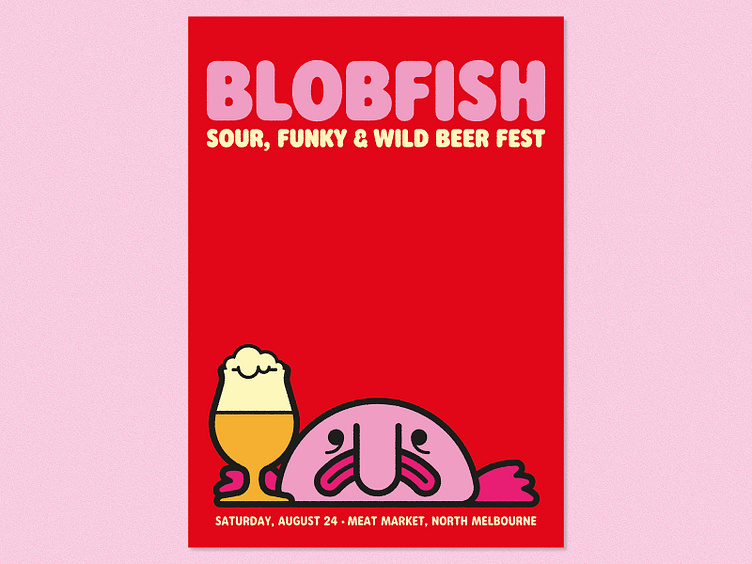


About this this time last year, a new beer festival that I'd been creating the branding for had just been announced. The festival, called Blobfish, was all about showcasing the wilder side of beer styles, such as sours, wild ales, saisons and the like.
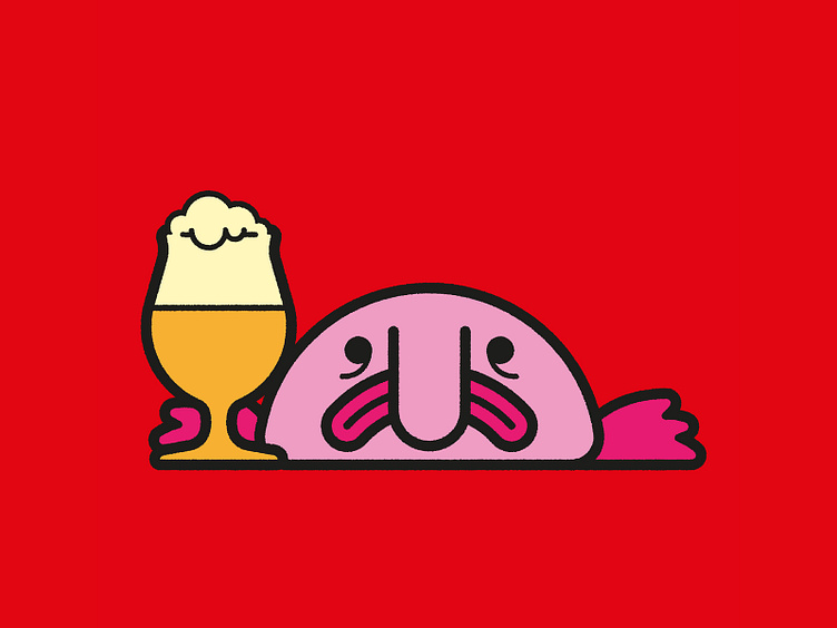
You can't really have a beer festival called Blobfish and not put this bizarre sea creature front and centre. However, when I started to look for some reference imagery for this little fella, it turns out there's only two or three photos that exist, so there's only so much you can do to make this feel completely unique.
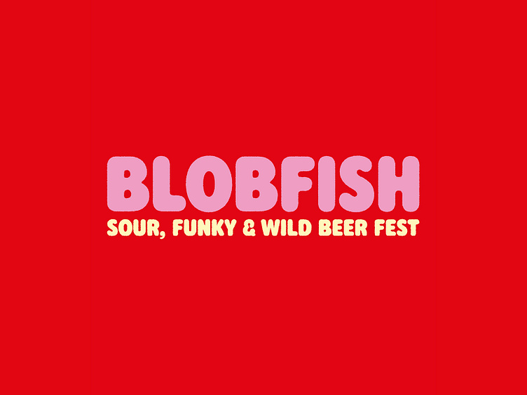
I love Central Type Company's Rodger font family, and it felt perfectly complimentary to the fish character, so I wanted to utilise it.
As is often the way, this was my favourite concept, but we ended up developing a route that had a looser, hand drawn aesthetic, paired with Latinotype's Recoleta typeface.
About this this time last year, a new beer festival that I'd been creating the branding for had just been announced. The festival, called Blobfish, was all about showcasing the wilder side of beer styles, such as sours, wild ales, saisons and the like.
You can't really have a beer festival called Blobfish and not put this bizarre sea creature front and centre. However, when I started to look for some reference imagery for this little fella, it turns out there's only two or three photos that exist, so there's only so much you can do to make this feel completely unique.
I love Central Type Company's Rodger font family, and it felt perfectly complimentary to the fish character, so I wanted to utilise it.
As is often the way, this was my favourite concept, but we ended up developing a route that had a looser, hand drawn aesthetic, paired with Latinotype's Recoleta typeface.