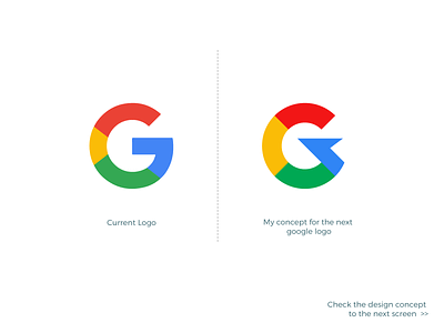
Google Logo - My Concept for the Next Level.
Behind the story : I know this is a very very tough challenge to re-design/upgrade/simplify the current google logo with following the current brand style as it's very modern, simple, and easy to understand. But, I have taken the challenge to upgrade it to the next level. I know my logo concept looks a bit sharp/edgy on the middle and right side. But, maintaining the brand style of the current logo I have found nothing better than this result.
The young or new generation loves to use a bit of sharp/edgy style as it expresses young, fresh/new, vibrating, and eye-catchy feel. My concept has also lightning bolt feel. Moreover, I am satisfied with the last result. Hopefully, you would be too. If yes, don't forget to submit an inspiring comment and a huge love/like here.
--------------------------------------------------
Contact me for your design project/s -
projects4designing@gmail.com
You may also check some of my other works here -
My 99designs' Portfolio.
--------------------------------------------------
Thank you!


