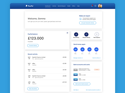
PayPal Update Design Concept
I use PayPal all the time, but I was never a fan of its summary. I thought elements got lost and there were too many options hidden in the menus that did not look like menus.
As part of a YouTube series where I redesign apps and websites, I thought this would be a great one to do.
https://www.youtube.com/watch?v=Rl6SLejc488&t=596s
Love to hear your feedback, let me know in the comments below.
or Just say Hi 👋
More by Gemma Helyer View profile
Like
