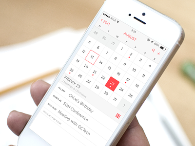
iOS 7 Calendar App Redesign
I'm not very impressed with iOS 7's version of the calendar app. They have removed the dots below the days with events on, so now when I forget what day something is on I have to click through each day until I find the event. I prefer the UX of the iOS 6 version, so this is my version of the Calendar app for iOS 7, with a mix of iOS 6's interactions and iOS 7's design.
Hope you like. Please follow
More by Kyle Craven View profile
Like
