Stilopizza - Pizza to Wear
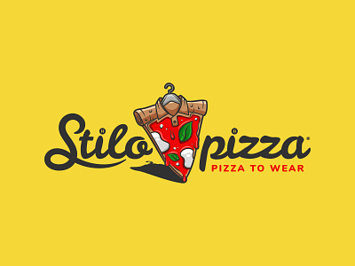
The Stilopizza logo was born from the intent to represent, through a fresh and youthful style, the meanings of "style" and "pizza". For this reason we used the shapes of a slice of pizza combined with those of an elegant collar with a hanger placed inside the crust that supports everything. The design was made with a slight perspective to the right that gives a glimpse of the thickness of the pizza, while the shadow positioned below increases its three-dimensionality.
The text part has been created using Google's Leckerli One font, modified in some parts to make it more attractive and visually compatible with the pictogram. The text has been divided into two parts and placed on the sides of the pizza in order to maintain a good symmetry of the composition, but it can also be placed keeping the drawing on the left and the whole text on the right.
The colours chosen give character and three-dimensionality to the design, in addition to the fact that they lead back, thanks to the green, white and red, to the colours of the Italian flag. These are contrasted by the colours of the pizza crust and a dark grey for the text, with a red to highlight the payoff.
On the whole, the logo is unique, easy to memorize and reminiscent of the type of activity for which it is intended.
