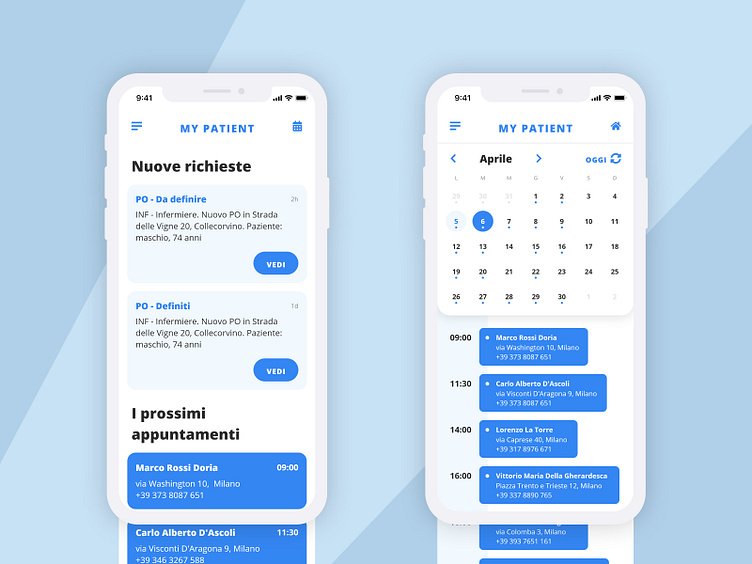
My Patient app - mobile
TL;DR The mobile and tablet app used as an appointment arrangement tool between Medicasa call centers and medicare professionals helped reduce the overall communication time by 40% and time spent on phone calls by 80%.
Project background The Italian company Medicasa recruits medicare professionals for patients who cannot or prefer to be treated at home via many of their operation centers around Italy. Operators in the centers call, text, e-mail the suitable medicare professionals to arrange appointments for patients according to their medical records provided by hospitals.
Project goal The project goal is to reduce the communication time between these parties.
My role I, with another service/UX designer, designed a mobile app for the medicare professionals and a back-office dashboard for the operators. I took part in the service design phase and was in charge of UX and UI phase on my own.
The prototype The most helpful output at the end was a high-fidelity prototype built with UXpin which was used for pitching, presentation, and reference for development. (The login page in the prototype is mocked, just enter random user name and PWD)
ResultThe My Patient app is up and running for 6 months now and available on both Android and iOS. It is reported that it helped reduce the overall communication time by 40% and time spent on phone calls by 80%.
PS I've been not so actively using Dribbble in the past, still trying to figure out which is the best format/way of using Dribbble. What is your advice?
