Ampersand & Ligatures
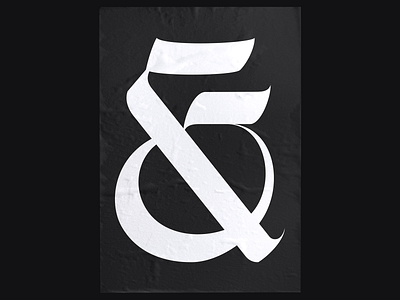


Little poster with a reworked version of the Ampersand that got the most vote - it also made the most sense with the rest imho.
Slide 2 & 3 you can see that, I added also some ligatures, which I believe still need improvement.
Slide 4 is a recap of all the characters included in the typeface.
Slide 5 for the symbols, 6 for the numbers - reworked as well.
The release might be soon, stay tuned.
As always, any feedback is appreciated!
Thanks for watching 😊
-
Don't forget to press "L" if you enjoyed it!
-
For collab & inquiries: lucas@graphikas.design