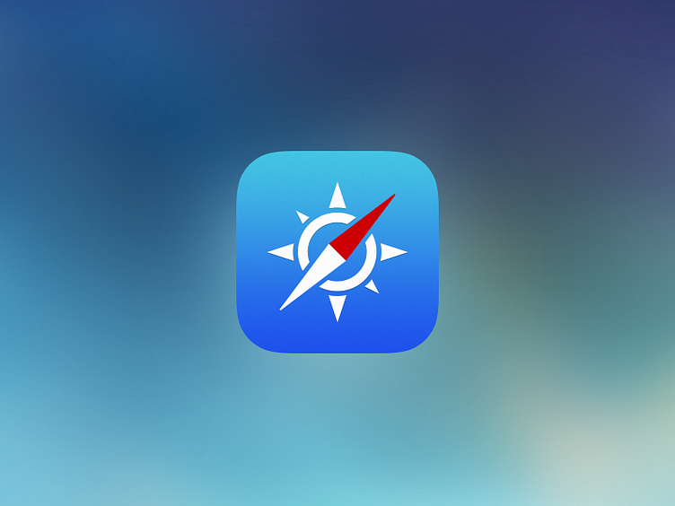
Safari Icon
Since I'm not the only one who isn't satisfied with a lot of the new icon changes in iOS7, I thought I created my own version.
The gradients based on the original safari icon, but much more subtle. Also kept – like the pre iOS7 icon – the trinity of the colors (blue, red, white) which is for me the essence of the safari icon. The compass is simplified: less fuzzy and unnecessary details, which makes it a lot easier to recognize in smaller sizes.
More by Ben Regali View profile
Like
