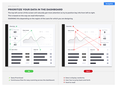
Do Don't UX - Prioritize your data in the dashboard
The top left corner of the screen will naturally get more attention so try to position key info from left to right. This is based on the way we read information. WARNING this depends on the region of the users for which you are designing.
⚠️
I am starting a TikTok page where you can follow my design diary/hacks.
I will also hunt bad UX! Do not hesitate to tag me (@do.don't.ux) if you find bad UX! 🎉
More by Do Don't UX View profile
Like
