Yen Flowers - Case Study 🌷


An unused concept which turned into a flower shop visual identity. We've got tons of symbols like this in our archive and this time we decided to make it into an imaginary brand identity.
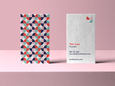
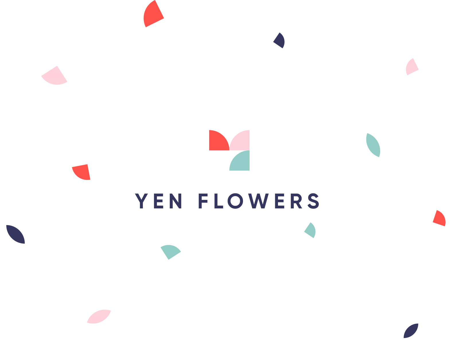
The symbol is made up of geometric shapes which depict the letter "Y" & Tulip.
Flowers are always blooming so we wanted to work on a palette that is soothing as well as engaging. We created the pattern system which could easily be used across all mediums.
Don't forget to give a follow me on Instagram