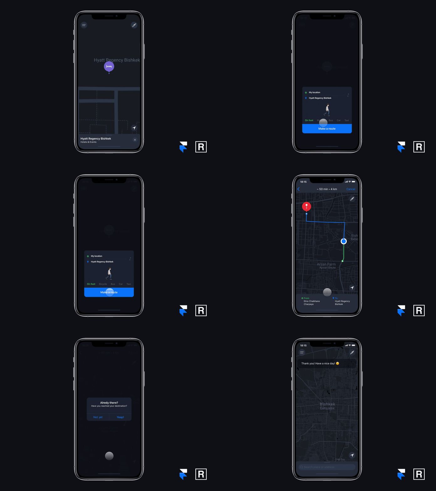
Redesign Maps.Me App
The redesign of the Maps.me app (an offline map of the world). We took our own bitter history of use: the search for a place and the path specified point. Our pain: it was not obvious in the app how to use the navbar. Our solution: we got rid of the unused buttons while securing UX/UI balance and minimized touch points leading to faster end results. Innovations: dark theme, modern emoji used to foster better user experience, more native iOS elements to please user habits.
😎UX/UI Design - Nick and Salima ⚡️Design tool - FramerX
Let’s create something great together RADFLIP
Press “L” to share some love ❤️
More by RADFLIP View profile
Like
