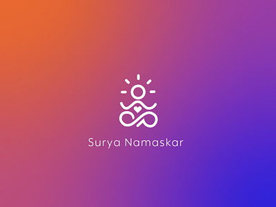
Logo made for a new yoga company
This logo was made for a contest for a new yoga company where the client needed line design logos and integrate orange and blue colours.
The brief was to design a minimalistic, quirky and fun logo, with the main inspiration was the symbol omega that represents the unit ohm of electrical resistance, and this unit ohm is pronounced as 'om'/'aum' which is often used in yoga and is also the sound of the Universe.
I have tried integrating the symbol omega by integrating it in the abstract curve of the hands, which also has the shape 3, which is in the symbol of Om/Aum.
More by Disha Shah View profile
Like

