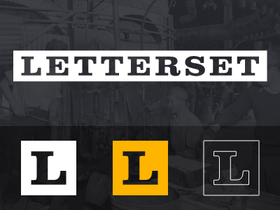
Letterset Branding
Some branding for a thing which I can't discuss yet, or maybe ever.
I basically wanted the logo to be somewhat modern and progressive, but still very definitely rooted in the past: Something that would last forever, but still have a typographic flair, and I think Clarendon provides that.
More by Conor O'Driscoll View profile
Like
