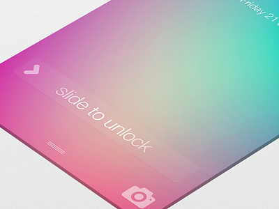
iOS7 Lockscreen
next on the list is the lockscreen :)
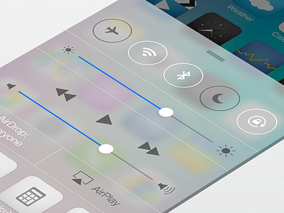
i wanted to make it easier for the user to understand exactly how to unlock the device (existing users will know). the new iOS7 unlock doesn't have a background but has the arrow for oppening the control centre, this arrow is very close to the unlock
to a new user this arrow seems like the first place to try as the arrow is pointing up giving the user an indication as to where to slide. I wanted to give a little affordance back to the unlock and also change the control centre handle along with the notifications handle.
many more screens to come with iOS7 tweaks and changes :)
real pixels as always attached.
More by Michael Shanks View profile
Like

