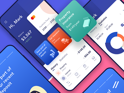
Banking App Design Concept
This is my attempt to create a better digital banking experience. Check out the screens I'm designed!
Main ideas:
🔵 To boost UI readability, we used color power. The blue-white mix helped us focus users on the most important functionality, separate different content areas and blocks.
💰To maximize UX, we decided to organize contacts by operations frequency. So, users can save time on common transactions.
I'm in love with this concept. Hope you like it as much as we do!
Press 👍 to spread some love!
More by Ilya Sablin View profile
Like


