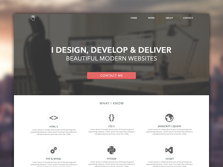
Portfolio Design
Hello Dribbblers!
Here's the current design to my portfolio. I'm aiming to keep it clean and minimal.
The navigation will most probably be some sort of anchored/paralax function, however with the work link I may send it to a dedicated page.
Also, on the work section the small arrow will be used to to fade new projects in, some need jQuery will be used!
Please let me know what you think! Any feedback and suggestions are welcome, please don't be too harsh on me though! Still a newbie in the whole design world!
Just to let people know, The header image isn't my own. I will be using my own once I've moved house and taken a picture. I will credit the persons image I found once I've re-found it!
EDIT : Here's the link to the header image I used - http://dribbble.com/shots/198784-Workplace
It's from David Hellmann, go check his work out! http://dribbble.com/davidhellmann
Here's a larger copy - http://d.pr/i/1LnT
Many thanks, Joss!
