McBetter

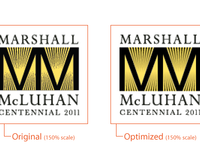
On the left - the original mark as delivered at 150% scale. On the right - my print and screen-optimized logo. Nice and crisp and perfectly even. It prints beautifully and looks great on screen. Unfortunately there's only so much I can do with the type, but I've tinkered a bit with alignment to try to get it to stay reasonably sharp and without losing too much detail.
Just FYI, these are from a screenshot of Illustrator in Pixel view mode.