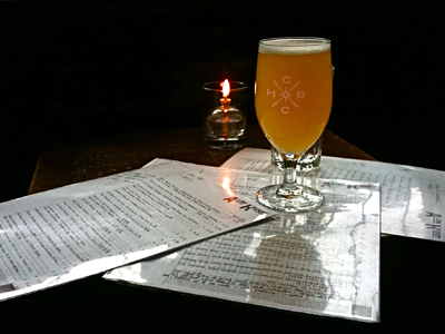
Glassware
This ought to clear up what I was working on with that last shot. We finalized the logo with a slightly heavier weight on the font, which is hard to tell in this shot but definitely makes it more legible at smaller sizes. Also working on: alternate logo for the special series beers, labels, and tap handles.
Dream job? You betcha.
More by Dave Shea View profile
Like
