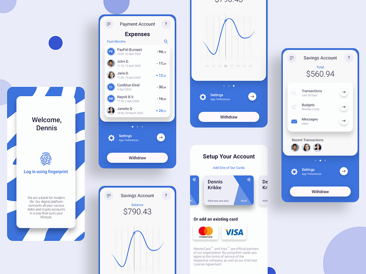
UI Exploration | Mobile Finance App #2
Hello,
This is my improved version of the Finance App UI I shared with you lovely people 2 days ago. I added an expenses tab and an account setup screen. I also cleaned up some minor details and alignments. I'm very very happy with this design and I hope you are too.
Don't forget to press "L" if you liked my work, it's very much appreciated :)
Have a nice day, Dennis
-------
See also: 36 Days of Type | AIce Cold Vol. 1 - Landing PageCard UI Elements #2
-------
And don't forget to follow me on Instagram
More by Dennis Krikke View profile
Like
