Font Weight vs. Font Size
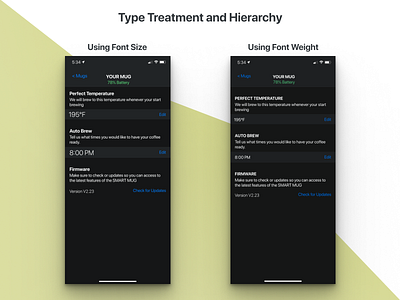
Still practicing different ways to design a settings page using typography as the main signifiers of function.
In the past shot, I tried using different sizes, in the right shot, I stuck to a 15 px font and adjusted the weight and color to establish hierarchy.
For a settings page that is supposed to be sparingly used, Doing something on the right might be a more efficient way to accomplish the job that needs to be done. No need to get fancy with font size here.
