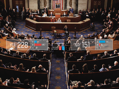
C-SPAN Vote Redesign
We cringe every time we see a Congressional vote on C-SPAN. It looks like they haven't updated their layout and graphics since the advent of color television.
We took it upon ourselves to design something more intuitive (especially for first time viewers) and we hope, easier on the eyes. By using a more graphic style, you can see where the vote stands with just a quick glance.
Check out the full version plus a before and after here.
More by Green Sheep Water View profile
Like
