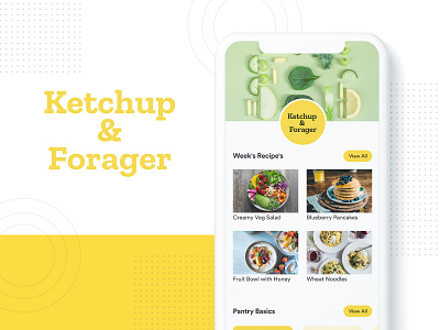
Food Application Design
Have a look on the designs made for a food application. The yellow color represents the hunger as we have been looking its use in big brands like McD, Nestle, Subway and many more and once you make the user feel hungry, the app servers it purpose.
Do share your comments and feedback on this shot.
==========================================
Show us some love and press “L”. Looking for UX / UI design solution? We are open for new projects. Visit our website.
More by SPEC INDIA View profile
Like

