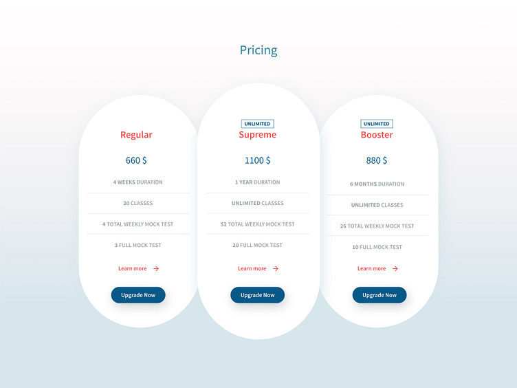
PTE Study Centre Pricing Table UI
Hello Dribbblers, Thanks in advance for investing your time in my process here. I am exploring pricing table UI style.
Problem: Current website has tons of pricing table in their each branch which is a huge cognitive load for the users. The challenge is to simply 7-8 pricing boxes. Also another challenge is to simplifying pricing table options and at the same time highlight their best package.
Design Thinking: - Reduced number of boxes from 8 to 3 - Highlight Supreme package which is best option for student and the business - Consolidate all the generic facility option with "Learn More" link which redirects either in a small popup or in a dedicated page (haven't decided yet)
Current website: http://ptestudycentre.com.au
Let me know if you have any thoughts.
Thank You
