Mobility Scooter Website UI
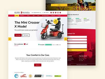
The user base was primarily elderly looking to purchase or upgrade a mobility scooter. The main focus was to help the user's experience by making the process as simple and easy to understand as possible. To do this we considered larger buttons/CTA's, easy to read fonts and text, bigger form fields and good contrasting colours.
We also couldn't stray too far from the current site's structure as we didn't want to confuse any returning customers, rather than redesigning from the ground up, we tried to build upon and improve the current features of the site that needed improving.